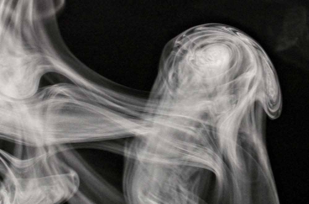
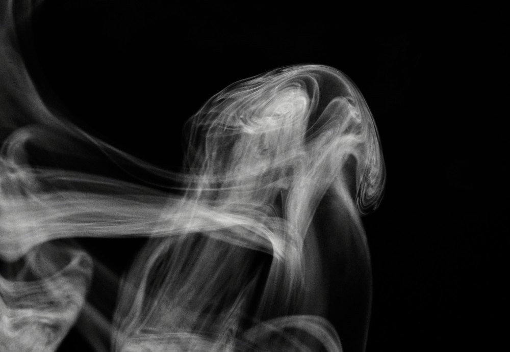
One of my photos was recently selected for Physics Today’s ‘Backscatter’ feature, so I thought a quick post on how to photograph smoke would be nice to add.
Photographing smoke is tricky, because there’s rarely anything obvious to focus on. But strong side-lighting, fast shutter speeds (1/100 s is the slowest), short focal lengths (to maximize depth of field), and patience will occasionally yield good images. Here’s two more, of a rising column of smoke:
Summer’s over, school is back in session.
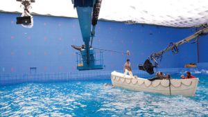
We had a fairly productive summer: a paper was accepted, we have some encouraging results transfecting our cell line with a GFP-tubulin construct, and started to commercialize our Tissue Interrogator. This picture has been featured in Physics Today and seems to be getting people’s attention:
Stay tuned for developments on these and other projects.
Summer vacation was also productive- I have been waiting 3 years for skies clear enough to make these images:
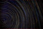
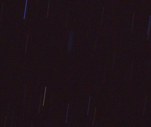
These are ‘star trails’: just leave the shutter open for a looooong time, and the stars trace out orbits due to the Earth’s rotation. See Polaris in the lower left? It’s not located *exactly* on the axis of rotation. The bright ‘dash’ in the lower right is a Air Force jet hitting it’s afterburner.
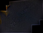
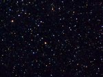
Alternatively, by stitching together multiple fields-of-view, we have the entire milky way: (warning, this full size image is *large*: 14k x 4k pixels

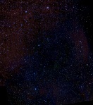
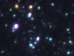
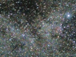
Finally, a smaller region of the milky way, featuring several Messier objects:

It started as a simple question: “What is the faintest star we can image with our equipment?” Figuring out the answer turned out to be delightfully complicated.
The basics are straightforward: since the apparent magnitude of a star is proportional to the amount of light striking the camera sensor, all we need to do is figure out how much light we need to generate barely-detectable signal.
Sky & Telescope magazine published a few articles in 1989 and 1994 under the title “What’s the faintest star you can see?”, and while much of that discussion is still valid, the question was posed pre-digital imaging, and so the results reflect the natural variability in human vision. It would seem that digital sensors, with their well-defined specifications, would easily provide an unambiguous way to answer that question.
Answering the question seems simple enough- begin by relating the apparent magnitudes of two stars to the ratio of “brightness” of the two stars: m1 – m2 = -2.5 log(b1/b2). So, if you have two stars (or other celestial objects), for example the noonday sun (m1 = -27) and full moon (m2 = -13), the difference in magnitudes tells us that the noonday sun is 400,000 times brighter than the full moon. Going further, the full moon is 3,000,000 times as bright as a magnitude 6 star (the typical limit of unaided human vision), which is 2.5 times as bright as a magnitude 7 star, etc. etc. But that doesn’t really tell us how much light is hitting the sensor, only an amount of light that is relative to some other amount.
Unfortunately, astronomers have their own words for optical things. What astronomers call ‘brightness’, physicists call ‘irradiance’. In radiometry (actually, photometry), ‘brightness’ means something completely different- it is a subjective judgment about photometric (eye-response weighted) qualities of luminous objects.
In any case, we have a way to make the ‘relative brightness’ scale into a real, measureable, quantity. What we do is ‘standardize’ the scale to a convenient standard irradiance, something that stays constant over repeated measurements, is easily replicated, and commonly available- for example, the irradiance of the noonday sun = 1 kW/m2.
So now we have our apparent magnitude scale (say: sun, moon, mag 6, mag 12, mag 16) = (-27, -13, 6, 12, 16) and corresponding relative brightness scale (sun: moon, moon: mag. 6, mag 6: mag 12, mag12: mag 16) that we make absolute by standardizing to the solar irradiance: 1 kW/m2, 3*10-3 W/m2. In table form:
magnitude rel. brightness irradiance [W/m2]
-26.74 1.00E+00 1.00E+03
-12.74 2.51E-06 2.51E-03
6 8.02E-14 8.02E-11
12 3.19E-16 3.19E-13
16 8.02E-18 8.02E-15
21 8.02E-20 8.02E-17
By specifying the entrance pupil of our telephoto lens (maximum aperture = 140mm; diameter = 1.5 *10-2 m2), for any given star we can calculate how many watts of optical power is incident onto the sensor. But we have to be careful: not all the light emitted by the sun (or any luminous object) is detected by the sensor.
In addition to not being a perfect detector (the ‘efficiency’ or ‘responsivity’ of a detector is always < 1), not all the colors of light can be detected by the sensor: for example, the sun emits radio waves, but our camera sensor is not able to detect those. Of the 1 kW/m2 of light incident on the earth, how much of that light is in the visible region- or equivalently, within the spectral sensitivity of the sensor?
Stars are blackbodies, and the blackbody spectrum depends on temperature- different stars have different temperatures, and so appear differently colored. For ‘typical’ temperatures ranging from 5700K (our sun) to 8000K, the fraction of light in the visible waveband is about 40%. So visible sunlight (V-band light), accessible to the camera sensor, provides an irradiance of about 600 W/m2 on the earth’s surface.
So much for the sources, now the detector- how much light is needed to generate a detectable signal? There are several pieces to this answer.
First is the average ‘quantum efficiency’ of the sensor over the visible waveband. Manufacturers of scientific CCDs and CMOS imagers generally provide this information, but the sensor in our camera (Sony Exmor R) is a consumer product, and technical datasheets aren’t readily available. Basing the responsivity of the Exmor R based on other CMOS imagers on the market, we estimate responsivity as about 0.7 (70%) This means that on average, 1 absorbed photon will produce 0.7 e-. That’s pretty good- our cooled EMCCD camera costs 100 times as much and only has a slightly higher quantum efficiency- 0.9 (90%).
So if we know how many photons are hitting the sensor, we know how many electrons are being generated. And since we know (based on other CMOS sensors) that the Exmor has a ‘full well capacity’ of about 21000 e- and a dark current level of about 0.2 e-/s, if we know the number of photons incident during an exposure, we can calculate how may electrons accumulate in the well, compare that to the noise level and full-well capacity, and determine if we can detect light from the star. How many photons are incident onto the sensor?
We can calculate the incident optical power, in Watts. If we can convert Watts into photons/second, we can connect the magnitude of the star with the number of electrons generated during an exposure. Can we convert Watts into photons/second?
Yes, but we have to follow the rules of blackbody radiation- lots of different colors, lots of different photon energies, blah blah blah. Online calculators came in handy for this. Skipping a few steps, our table looks like this:
magnitude rel. brightness irradiance [W/m2] power incident on sensor [W] 6000K blackbody V-band phot/sec e-/s
-26.74 1.00E+00 1.00E+03 1.54E+01 6.83E+18 4.78E+18
-12.74 2.51E-06 2.51E-03 3.87E-05 1.72E+13 1.20E+13
6 8.02E-14 8.02E-11 1.23E-12 5.48E+05 3.83E+05
12 3.19E-16 3.19E-13 4.91E-15 2.18E+03 1.53E+03
16 8.02E-18 8.02E-15 1.23E-16 5.48E+01 3.83E+01
21 8.02E-20 8.02E-17 1.23E-18 5.48E-01 3.83E-01
18 1.27E-18 1.27E-15 1.96E-17 8.68E+00 6.08E+00
You may have noticed a slight ‘cheat’- we kept the temperature of the blackbody constant, when in fact different stars are at different temperatures. Fortunately, the narrow waveband of interest means the variability is small enough to get away with 1 or 2 digits of accuracy. As long as we keep that in mind, we can proceed. Now, let’s check our answers:
Moon: we have 1.2E+13 electrons generated every second, which would fill the well (saturated image) after 2 nanoseconds. This agrees poorly with experience- we typically expose for 1/250s. What’s wrong?
We didn’t account for the number of pixels over which the image is spread: the full moon covers 2.1*106 pixels, so we actually generate 5.8E+06 electrons per pixel per second- and the time to saturation is now 1/280 second, much better agreement!
Now, for the stars: a mag. 6 star (covering 20 pixels) saturates the pixels after 1 second, a mag. 12 star after 280 seconds, and a magnitude 16 star requires 10,000 seconds- about 2.5 hours- of observation to reach saturation.
But we don’t need to saturate the pixel in order to claim detection- we just need to be higher than the noise level. A star of magnitude 18.5 produces (roughly) 0.2 e-/s and thus the SNR =1. In practice, we never get to this magnitude limit due to the infinitely-long integration time required, but image stacking does get us closer: our roughly 1-hour image stacks start to reveal stars and deep sky objects as faint as 15 magnitude, according to the database SIMBAD. Calculations show that observing a mag. 15 object requires 4300 seconds of time to saturate the detector, in reasonable agreement with our images.
This is pretty good- our light-polluted night sky is roughly mag. 3!
Why did we even think to ask this question? Wide field astrophotography is becoming more common due to the ready supply of full-frame digital cameras and free/nearly free post-processing software. In fact, the (relatively) unskilled amateur (us, for example) can now generate images on par with many professional observatories, even though we live in a relatively light-polluted area.
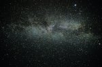
What we have recently tried out is panoramic stitching of stacked images to generate an image with a relatively large field of view. This time of year, Cygnus is in a good observing position, so we have had direct views of the galactic plane in all it’s nebulous glory:
This image, and those that follow, are best viewed at full resolution (or even larger- 200% still looks great) on a large monitor to fully appreciate what nighttime at Atacama or Antarctica are probably like.
Some details about how we make these images- we acquire a few hundred images at each field of view, separately stack each field of view with Deep Sky Stacker and then fuse the images with Hugin. It may be surprising to know that each field of view must be slightly ‘tuned’ to compensate for the differences in viewing direction, as opposed to simply stacking all of the images at once and choosing “maximum field of view” in DSS.
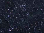
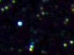
Here are two subfields within Cygnus- the edge of the North American Nebula, and the Veil Nebula:

There’s a good story behind this photograph:

The weather is nicer now, and I’ve been able to spend some time learning how to photograph birds. It’s not complicated- use a fast (low f/#) telephoto lens (long focal length lens), but it takes skill to accurately locate a plane of focus. So what does this have to do with ‘Blade Runner’, a Ridley Scott film based on a novel by Philip K. Dick? That’s the story….
Like many people, I was (and still am) transfixed by the movie. At the time, I had recently seen “Empire Strikes Back”, but was too young to see “Alien”. “Blade Runner” was a revelation.
After, one sequence in particular stood out to me- the scene when Deckard finds a photo of Zhora, and using “super-sciencey image technology”, zooms in to find a synthetic snake scale.
Possibly, what interested me about the ‘zoom’ sequence was the intensely visual aspect to image manipulation- not just zooming in and “enhancing” (which as I sadly learned in grad school, is fantasy), but also the three-dimensional aspect to looking behind objects (which, as I happily learned in grad school, is possible).
Back to the bird. See it’s eyeball? It’s reflective, like a mirror. It’s not apparent when I shrunk the photo, but the plane of focus is located exactly on the eyeball and on the picture above, all you can see are a few shiny spots. Rather than do all the intermediate magnifications, I’ll now immediately zoom in by a factor of 100X:
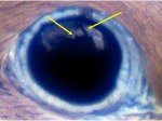
That is a clear image of backyard. One arrow points to a tree, and the other points to our chimney. Pretty cool! Here’s the ‘real’ scene (flipped horizontally to simulate a reflection):

Science fact!
But in truth, that’s not my favorite part of “Deckard finds a photo of Zhora, and using ‘super-sciencey image technology’, zooms in to find a synthetic snake scale.” The best part of that sentence is when we learn the scale is *synthetic*. As it happened, a year or two earlier (say late 1980-early 1981), I happened to check out of the library a certain book, and quite amused to see the same image on a movie screen! This website tells the story better than I can.
We learned something unexpected recently.
Other than microscope objectives, I use three photographic objectives- a wide angle (15/2.8), a ‘normal’ (85/1.4), and a telephoto (400/2.8). For astrophotography, I have always used the 800/5.6 lens combination (400mm + 2x tele) because I wanted to image faint, distant, objects. The large entrance pupil (143mm diameter) of the lens acts as a large ‘light bucket’, and the long focal length provides high magnification:

As I’ve posted previously, using either the 400/2.8 or 800/5.6 configuration, I stack around 100 15-second exposures acquired at ISO2000- and those 100 images are the top 20% in quality of all acquired images. By contrast, using a shorter focal length lens would increase the acceptance rate because the residual alignment error is below the resolution limit of the lens. Using the 85mm lens, I can acquire 30s exposures at ISO100 and use 100% of the images.

One way to quantify the ‘efficiency’ of a lens is to compare the size of the entrance pupil to the size of an Airy disc- under ideal conditions, the amount of light entering the lens is concentrated into an Airy disc. Analysis shows that the efficiency scales as f^2/N^4, where f is the focal length and N the f-number.
Calculating the efficiency provides the following table:
focal length f/# entrance pupil diameter Airy disc radius irradiance concentration relative gain
400.0 2.8 142.9 1.7E-02 298714.3 1.0E+00
85.0 1.4 60.7 8.5E-03 107910.6 3.6E-01
800.0 5.6 142.9 3.4E-02 149357.2 5.0E-01
15.0 2.8 5.4 1.7E-02 420.1 1.4E-03
What is surprising is the effect of the N^4 dependence: the 85mm is nearly as efficient than the 400mm (72%) in spite of having an entrance pupil substantially smaller.
This chart shows that the 85mm lens is very well suited for astrophotography in terms of viewing faint objects. However, the lower angular magnification results in a loss of spatial detail, meaning the 85mm is not suitable for viewing nebulae, clusters, galaxies, planets, etc. Here are image pairs comparing the 85mm and 400mm lenses:
The chart also (apparently) shows that the wide-angle lens is very unsuited for astrophotography- as compared to the 400/2.8, the efficiency is 0.1%. So, I was very surprised when I recently used the 15mm lens to image the galactic plane around the constellation Cygnus, with individual exposures of 13s @ ISO 2000:
This was completely unexpected. Even though the 15/2.8 is only 0.1% as efficient as the 400/2.8, the image brightness is as high as what I can generate with the 400/2.8, using essentially identical exposure times. How can this be?
The reason has to do with the density of stars. If I am imaging in a direction pointing out of the galactic plane where the density of stars is low, I would indeed conclude that the 15mm lens is unsuitable. However, each airy disc at the image corresponds to an angular field of view (named the ‘instantaneous field of view’, named back when detectors were single pixels and a scanning system was used to create an image plane), and since the field of view of the wide-angle is considerably more than the telephoto, there is an amplification factor due to the presence of multiple stars ‘sharing’ a single airy disc.
That is to say, when the density of stars is high and the lens magnification low, many stars will be imaged to the same airy disc, resulting in brighter images. How do the lenses compare with this metric?
At this point I have to mention the standard disclaimer about Bayer filters and color cameras. That said, measuring the size of an airy disc from the acquired images results in this table:
f f/# field of view (deg) field per pixel (rad) back projected solid angle for Airy disc (sterad) density gain magnification
400 2.8 5.2 1.50E-05 8.15E-09 1.0
85 1.4 23.9 6.92E-05 7.65E-08 9.4
800 5.6 2.6 7.52E-06 4.09E-09 0.5
15 2.8 100.4 2.91E-04 3.04E-06 372.8
Taking both factors into account results in this metric:
focal length f/# Overall efficiency
400.0 2.8 1.00
85.0 1.4 3.39
800.0 5.6 0.25
15.0 2.8 0.52
When the density of stars is high, I only need to double the ISO when using the 15mm in order to match the performance of the 400mm. Even more surprising, the 85mm lens is more than 3 times as efficient- in practice, this means I can use a lower ISO setting (ISO 100 instead of ISO 400), reducing the gain noise.
The moral of the story is: try new things!
This time of year, M57 (the ring nebula) is advantageously located in our night sky, so this is a good opportunity to discuss astrophotography.
The basic problem to be solved is that the objects are of very low intensity and are moving. Here’s a sample image:
This is a 20-second exposure using our 800mm f/5.6 lens, ISO 2000. Because we know how fast the stars are (apparently) moving- 360 degrees in 24 hours- we can calculate how long the shutter could be open before this motion blur occurs. For this lens and camera (pixel size = 6 microns, but there is a Bayer filter present), the maximum shutter speed is about 1/4 second: within 1/4 second, the stars move less than a pixel. That’s suboptimal, to say the least. We could try to improve things by using a faster lens and higher sensor gain, but our setup is already close to the limit of what is commercially available.
The solution is to use a ‘tracking mount‘. There are lots of different designs, ours is a ‘German equatorial mount‘. The basic procedure is very simple- align the polar axis of the mount to the North star and turn on the motors. When aligned, The two motors correspond to declination (latitude) and right ascension (longitude). Then, the mount essentially ‘unwraps’ the Earth’s rotation, ensuring the telescope remains pointed at the same part of the night sky. This is also a 20-second exposure, but taken with the tracking mount aligned:

much better! The final step is to take a lot of these images and average them all together (‘image stacking’).
Naturally, life is not as simple as that. Most images look like this:

What’s the deal? There are lots of reasons why this image still has motion blur: vibrations, polar misalignment, gear error, etc., and it’s illuminating to calculate acceptable limits. First, let’s dispense with the pixel size issue- the sensor dimensions result in a single ‘pixel’ as being 6 microns on a side. However, in order to generate color images, a Bayer filter is placed over the pixel array, so that neighboring pixels are assigned different colors (and detect slightly different parts of the object). A detailed analysis is highly complicated- 3 independent non-commensurate samplings of the image plane- but if our image does not have features smaller than say, 12 microns (corresponding to a 2×2 pixel array), software interpolation that generates a color pixel using the neighboring elements will likely give an accurate result, and we can pretend that our sensor has 6-micron color pixels.
And in fact, examining our ‘best’ single image, stars are imaged as bright blobs of radius 3 pixels (and brighter stars appear as even bigger blobs).
Ok, so how much can the sensor move without causing motion blur? The stringent limit is that the sensor (or the image projected onto the sensor) must move less than 0.5 pixel (3 microns) during an exposure. If the lever arm of the lens is 0.5m, the allowed angular displacement is 1.2 arcsec. In terms of vibrations, this is a very stringent requirement! Similarly, we can calculate the maximum allowed polar misalignment: if the telescope pointing is allowed to drift no more than 0.5 pixel during an exposure, since each pixel subtends 1 arcsec (for diffraction-limited performance using this lens), the allowed misalignment is about 6 arcmin (http://canburytech.net/DriftAlign/DriftAlign_1.html is a good reference).
Speaking of diffraction-limited, what is the limit of our system? Each star should be imaged as a single pixel! Clearly, there is image degredation not just from movement, but from *seeing*- clear air turbulence appears as blur in long time exposures. How much degredation? Our “best” images correspond to using a lens at f/30, or an entrance pupil diameter of 27mm (instead of f/5.6, 140 mm entrance pupil diameter). The seeing conditions in Cleveland are *awful*!
So why do astrophotography? Our images are not meant to compete with ‘professional’ telescope images. It’s also a nice experience to learn about the night sky and work on our imaging technique. Here’s the result of stacking enough ‘best’ 20-second exposure images to produce a single 29 minute long exposure:

Not bad! And we can continue to improve the image- either by ‘dithering’ the individual frames to allow sub-pixel features to emerge:

or by deconvolving the final image, using a 3-pixel radius Gaussian blob as the point-spread function:

The image improvements may not appear that significant, but as always, the rule of post-processing is *subtle* improvements- no artifacts must be introduced.
The American Institute of Physics journal “Physics of Fluids” sponsors a ‘gallery of fluid motion’ every year (http://pof.aip.org/gallery_of_fluid_motion) and without fail, the selected images are breathtakingly amazing. Our images don’t make the cut.
Fortunately, we can display our own gallery of fluid motion right here. The following images were all taken at Cape Hattaras, North Carolina, part of the Outer Banks, infamous for the number of shipwrecks caused by sandbars located all along the coast.
Let’s discuss waves- specifically, ocean waves that break onto the beach. This is a ubiquitious phenomenon (especially if you include lakes, not to mention waves formed by sloshing around a tank), and yet the mathematics behind these structures is hideously complex.
It’s not clear why, but fluid mechanics (and its parent discipline, continuum mechanics) is essentially absent from the Physics curriculum. The mathematics are well established- classical field theory, differential geometry , etc- and the physical concepts are well posed (homogeneous/multiphase systems, thermodynamics, conservation laws, etc.) but nearly all the interesting work has been left to mathematicians and engineers (who have produced a stunningly beautiful body of knowledge). Stoker’s “Water Waves” is an especially good reference.
The problem of waves falls under the general problem of ‘interfacial phenomena’ and ‘free surface flows’, which are the red-headed stepchildren of continuum mechanics- the fluid-fluid boundary is no longer specified but is free to deform, so the interface shape is now part of the overall problem to be solved. Also, the no-slip boundary condition no longer holds. And as we will see, even the hypercomplicated problem of a free surface dividing two homogeneous Newtonian fluids is simple compared to the typical complexities of real ocean waves.
For now, consider the interface between water and air as a two-dimensional surface, referred to as a Gibbs dividing surface, possessing physical properties independent of either bulk material. The curvature of the surface is proportional to the pressure jump across the surface, for example. Also, when we say ‘fluid’, we generally mean the seawater, as opposed to the atmosphere.
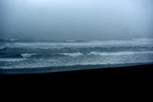
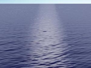
Let’s start with an image of the ocean surface far from the shore:

This surface is dominated by long-wavelength waves (long waves) parallel to the beach covered by fairly uniform short-wavelength ripples. The dynamics of this image are fairly well understood- the wavespeed, dispersion relations, the overall velocity field within the bulk fluids, etc. – because the height of the waves is much smaller than the depth of the fluid, and the depth of the fluid is constant over many wave periods. Perturbative approaches are well suited to this problem and have produced useful results. For example, the speed of the wave is sqrt(gh), where h is the height of a wave and ‘g’ is 9.8 m/s^2.
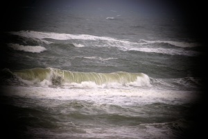
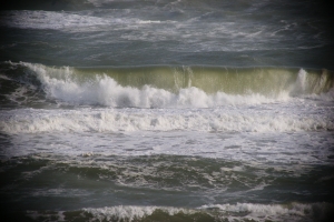
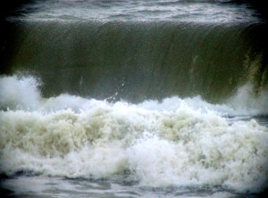
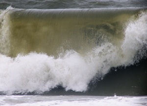
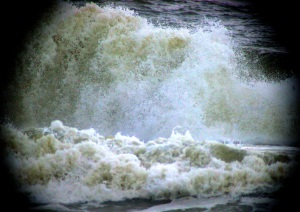
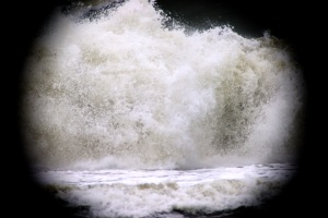
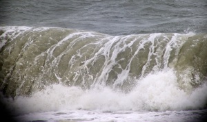
However, as the waves approach the shore, the fluid depth changes rapidly, resulting in ocean fluid ‘piling up’ behind the wavefront and eventually breaking over the top, which is more visually appealing:
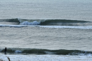
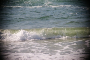
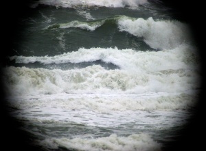
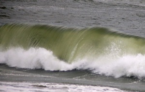
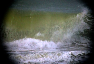
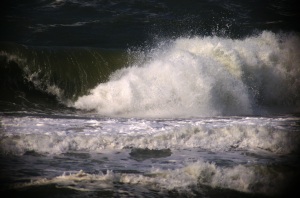
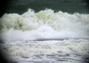
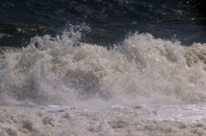
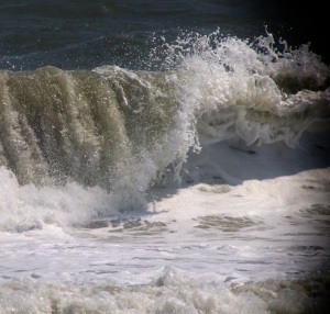
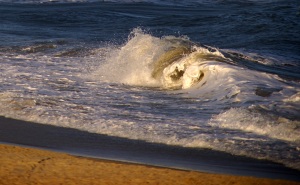
The upper image is useful to get a sense of scale- the front wave is about 3 feet high, while the rear wave is closer to 6 feet. For now, we will only discuss these ‘medium’ waves- of height 3-6 feet. The lower image is of a 3-foot wave, and displays a very uniform ‘phenotype’- very regular height and cylindrical profile, justifying 2-D treatments of the problem. Let’s look at the waves from a more oblique angle:
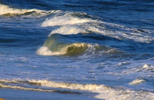
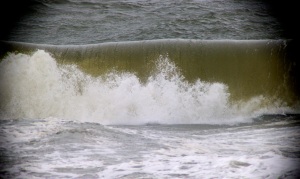
In these images, it’s possible to see what looks like ‘viscous fingering’- the wavefront divides into multiple ‘fingers’, which break independently.
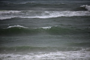
Now let’s focus on the crest of a wave- it turns out that the height of the crest is proportional to the depth of the water- the larger wave, further out, is in deeper water. The wave crests (‘breaks’) when the slope becomes infinite (vertical). Short waves break sooner than long waves, and breaking occurs faster as the uniform ‘background’ fluid velocity decreases- when a wave breaks and retreats (negative velocity), the following wave breaks much sooner. Where the wave crests, and how high the wave is at cresting, tells us information about the spatial variations in ocean depth.
A note about how these images (and the remainder) were taken. Primarily, a 400/2.8 (or 800/5.6 using the 2x tele) lens was used, and the optimal lighting conditions are usual for capturing fluid motion- lots of light (direct sunlight), ‘harsh lighting’ (lots of contrast), and fast shutter speeds- 1/1000s or faster. Consequently, the lens was used at full aperture, resulting is a narrow depth of field- it was tricky to get the wave in focus, but when it is in focus , each droplet of water can produce a little flash of light like a star. It’s worth looking at these images full-scale, there is a lot of detail.
We should now pause and ask about the origin of the fluid velocity- the motive force, so to speak. The origin of tidal flow is due to the moon, but what is the origin of ocean waves?
The source of waves is wind: air flowing over the ocean surface. No air, no waves. The waves propagating to shore were produced by wind far offshore- thus the character of waves tells us about the weather conditions far offshore- stormy, calm, etc. The direction of airflow is not really correlated with ocean currents, thus another complication is that the problem is intrinsically 3-dimensional. Yep, no interesting physics here…
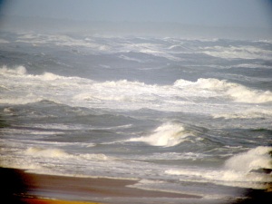
So, let’s add wind: it should be clear that some images were taken when the offshore weather was relatively calm, while others were taken when a storm was present- the waves are bigger and more closely spaced. Here is what happens when an on-shore 30 mph wind is added, blowing from the shore into the water, as a storm came onshore:
The waves appear much different- less cresting, flatter waves.
Upon closer examination of the images, additional features appear- the waveheight varies along the crest, for example, and in addition to the long-wavelength variation of wave height, there is a short-wavelength feature as well, and the top of the cresting wave takes on a ‘glassy’ appearance. As the wave crests, the crests merge at semi-regular intervals to form a ‘seam’.
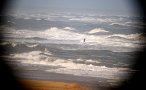
What about larger waves, 10-15 feet in height. Do they appear similar or different?
What about the splash as the wave falls back onto the water?
What if we allow the mechanical properties of one of the fluids to change- foam formed by the waves can build up and mix with the fluid, changing the ocean fluid from a simple Newtonian fluid into a visco-elastic fluid- note the thicker ‘ropey’ structure.
Clearly, ocean waves display a complex behavior that is difficult to model. And we haven’t yet discussed the sand under the water- it’s a granular material that can flow, and in fact forms structures that look like dunes, in an orientation parallel to the waves. So we have, in general, a time-dependent 3-D mechanics problem involving a homogenous fluid (air), an inhomogenous fluid (the ocean water/foam) and a granular material (sand). If we wanted, we could add thermodynamics to the problem- to model solar heating, for example.
Let’s see how the computer graphics special effects folks do:(from http://hal.inria.fr/UNIV-GRENOBLE1/inria-00537490)

Not bad for calm water- but recall, that first image up top is very amenable to modeling. Here’s a still from “Surf’s Up”: (http://news.cnet.com/8301-13772_3-9862945-52.html)

Also not bad (Sony *did* get an Oscar nomination for this, after all)- but it’s not clear how much of the animation was based on physics and how much was smart illustration (http://library.imageworks.com/)

Here it’s clear that the model can’t compare to reality- the wave surfaces are *way* too smooth. In order to get realistic waves, Ang Lee used a giant tank for his movie, “Life of Pi”:
Illustrators can do a better job of capturing the dynamics, but omit a lot of detail:


That said, it’s important to remember that we can simplify the problem and extract out useful information- the 2D approximation for long waves is one simplification. Modeling ocean waves, while useful for various industries, can be applied to other problems as well- for example, airflow within the lung. Within the airway there is a homogeneous fluid (air), viscoelastic fluid (mucus/airway surface liquid), and a deformable soft matter layer (epithelial tissue). The air can be seeded with particulate matter (airbourne contamination), and we can model where those particles are likely to accumulate in the airway. We can also model the effects of adding a surfactant, often used as a medical intervention for premature newborns who don’t have a well-developed lung.
On an earlier post we mentioned our cell cultures became contaminated by mycoplasma. Fortunately, we have been able to eliminate the contagion and are currently writing our results for journal submission. Concurrently, the optical trap team completed calibrating the instrument, those results should be submitted soon as well. We have begun to do some actual science in the lab (not to disparage the chip images….)!
We have been able to get the summer off to a great start and have several experiments either planned or already in progress to further explore how fluid flow can provoke (or inhibit) physiological/structural responses in cells and tissues. Primarily we use a cell line taken from the kidney (specifically, the cortical collecting duct) of a mouse, but we have a variety of cell types (other epithelial and endothelial cell lines from a mouse, pig, cow, and dog) that we can use as well. These cells grow a ‘primary cilium’. which is genetically related to a bacterial flagellum, and we focus on this structure as a possible ‘cell signalling organizing center’ to transduce a mechanical to a biological signal.
On the other side of the lab, several students are developing improved analytic and numerical models of our experimental apparatus- the flow chambers, laser tweezers, etc. and extending and improving the capabilities of our live-cell microscope. Finally, a pilot project is underway to construct a small microfluidics fabrication facility that can be used by other research groups.
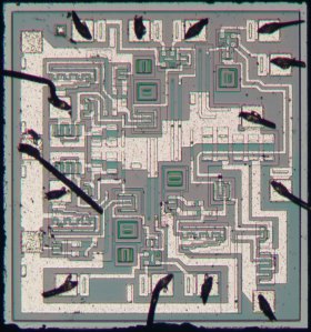
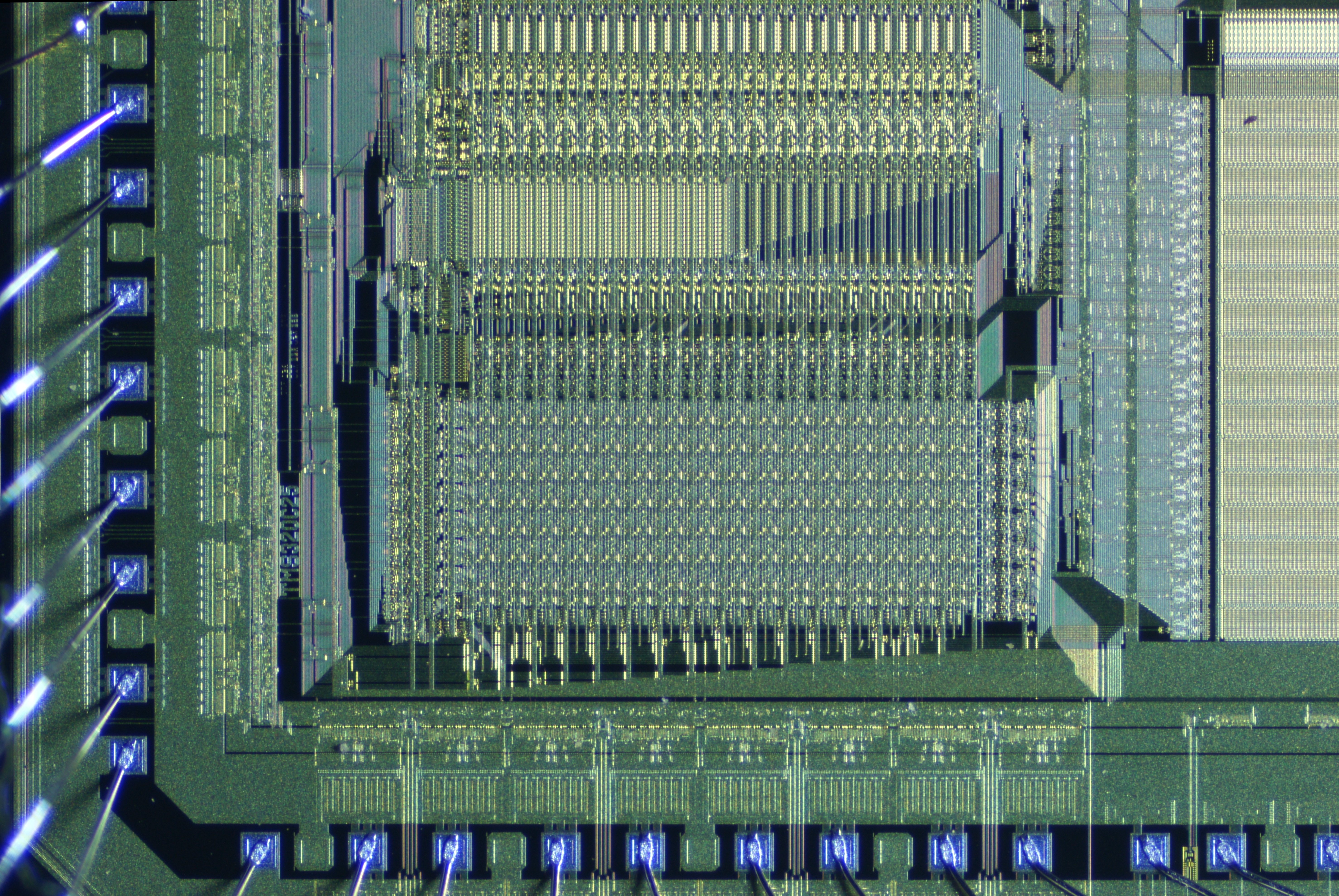
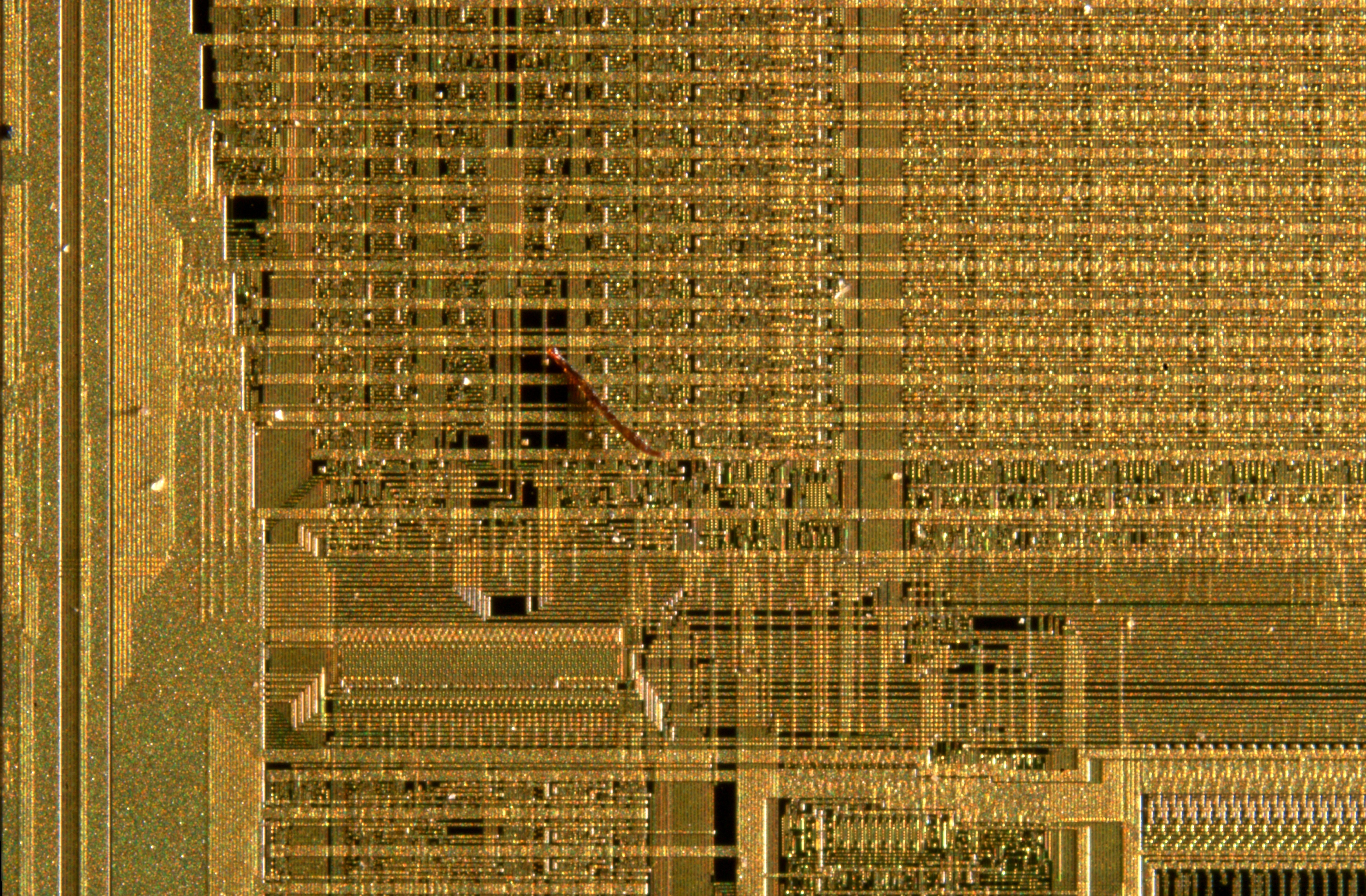
Lately, We have traced back the history of integrated circuits to a few very early devices, primarily manufactured by RCA and examples of ‘MOS’ type ICs. The metal-oxide-semiconductor geometry was the final design revolution, leading directly to modern chips. However, there were (and still are, unlike RCA) other manufacturers. Here’s a Raytheon RC1033 3-input NOR circuit:
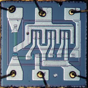
The circuit logic is fairly easy to follow. Around the same time (1966), Motorola was producing the MC832P, a 4-input NAND gate:
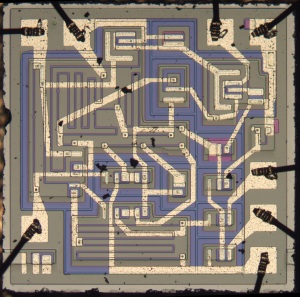
later (1969!), Motorola was making the 3000L quad 2-input NAND gate:
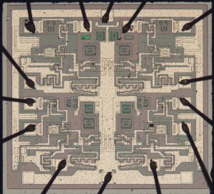
and 3005L, a triple three-input NAND gate array:
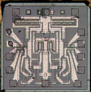
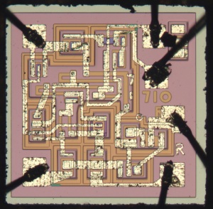
Yet another company, Fairchild Semiconductor, introduced a radically different kind of circuit- the operational amplifier. Here are images of the μA709, Fairchild’s breakthrough product:
the LM710:
μA741:
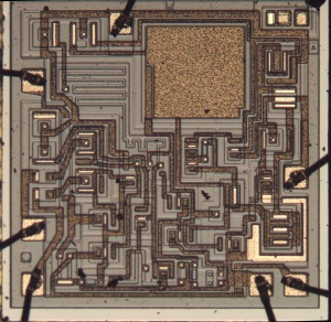
and μA741 made by AMD the next year (1972):
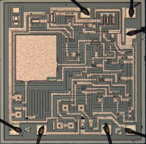
Lastly, here’s one we have yet to identify, part code U5B771239:
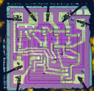
If you know what this is, let us know!
The Fairchild cicuits look radically different than the others- there’s no obvious symmetry to the layout, as opposed to the previous examples.


![New-Out99995-_Pyramid Maximum Contrast[1,0,1] (2)](https://resnicklab.files.wordpress.com/2013/06/new-out99995-_pyramid-maximum-contrast101-2.jpg)
![New-Out99995-_Pyramid Maximum Contrast[1,0,1]](https://resnicklab.files.wordpress.com/2013/06/new-out99995-_pyramid-maximum-contrast101.jpg)


